Pages

Showing posts with label Editing Pictures. Show all posts

Monday, January 19, 2015

Working with Portraits

Tool Box
With the portraits that I had taken during my photo shoot with Taylor, Miranda and Felicity I learned how to do several different things on photoshop that helps make your portraits stand out more.

Brightening Teeth

To do whiten teeth you need use different tools on the tool box. I have the ones that I used circled in different colours to give you an idea of what each tool looks like.

Step One & Two


Step One: First zoom into your subject's teeth with the zoom tool. (Circled in green on toolbox.) This helps you see the colour of the teeth better, and allows you to get a better idea of what you are changing. Then you grab the lasso tool (circled in red on toolbox), and you draw around the teeth. It doesn't have to be perfectly outlined, so you can do this step very quickly.

Step Two: On your layer palette, select the Hue/Saturation option. After you do this a Hue and Saturation bar opens up.
Steps 3 & 4


Step Three: By the option that says Edit it is set to the option Master. Click on the arrows and select the Yellow option.

Step Four: After you turn the edit option to yellow, take the saturation bar and drag it all the way down. As you do this, you can look at the teeth you are editing and you can see that you took the yellow in your subjects teeth completely away!
Step Five & Six

Step Five: Now that you have taken the yellow out of your subjects teeth, you might as well brighten them . Go back to the edit option, click on the arrows and select the master option.

Step Six: After you switched the edit option to master, bring up the lightness a little. Do not turn it uo really high because you do not want your subject's teeth to look unnaturally white. If you watch the teeth while you adjust the lightness you see that the whole area that you had lassoed lightens up. Don't worry about that, it is suppose to happen! There is a few more steps that will take that right out!


Step Eight
Step Seven: Go to your toolbox again and look at your foreground and background setting. (Circled in purple on toolbox) Make sure that the foreground tool is set to black. If its not, just click on that box and a tab with colours pop up and you can easily just select the colour black.

Step Eight: Then go to the top of your screen and select Edit and then the Fill option. After you do this a fill box pops up. All you have to do is click on the arrows by the Use option, and select the Black option. This will fill in the lightened spot on your image, which makes your teeth go back to yellow again.

Step Nine: To get your teeth white and shiny again, grab the paintbrush tool (circled in yellow on toolbox) and paint your teeth. This will make the white and shiny again. (On picture labeled Step Nine, I painted the left side of miranda's mouth so you can see what the paint brush does if you compare it to the right side of her mouth.) And that is all you have to do!

Step Nine

Before and After shots of Miranda's brightly new teeth.
Brighting eyes:

Tool Box
I really wanted to learn how to brighten eyes in portraits to get that wow look. Unfortunately the result was not very exciting, because in all my portraits people either have their eyes closed, or their eye is shadowed by their hair so one eye is darker then the other, which makes it hard to brighten them because they look like two different shades of eye colours. I still think the way to do it is neat, and next time I take a portrait I will make sure my subjects eye is shown clearly, and I will try to brighten it with photoshop.
Step One & Step Two. Before and After shots of colouring
the white part of Miranda's eyes. 

Step One: Zoom into your subjects eyes with the zoom tool. (Circled in red on the tool bar.) Then select the dodge tool. (Circled in purple on the tool bar.)


Step Three. Before and After shots of Miranda's brightened eye. 

Step Two: Once you've selected the dodge tool, the settings at the top left hand of the screen change. The settings you will be changing will be the brush size, and the exposure. First change your exposure to something low, like 12%. The take your dodge tool and colour the white part of your subjects eye. Change your brush size to a size that fits the white areas of the eyes.


Step Three: After you have coloured the white parts of the eye, change your exposure to something higher. I changed mine to 25% but you can go higher. Then colour the colour part of the eye, not including the pupil. And viola! Your subjects eyes are much brighter.
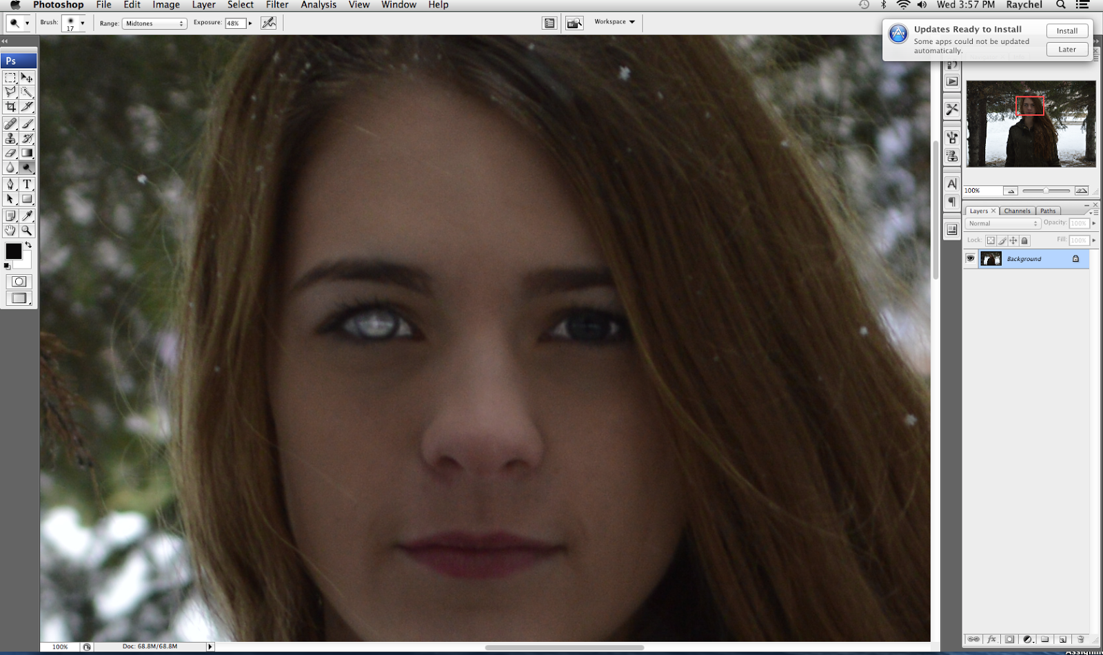


Fun fact! If you ignore the tutorials advice and don't change your exposure to a lower setting, you are going to make your subjects eyes VERY bright... which is as you can see by Miranda's eye is not a very flattering look! So do not forget to change you exposure settings like I did, otherwise you could get very alarming eye results.


Here are the before and after pictures of my edit to Miranda's eyes. If you get a close look you can see that her eyes are a bit bluer. I am hoping the next portrait i take will have a close up of someones eyes so you can see a more clearer difference.


Blurring the Background of a Picture:
Another thing I've really been wanting to learn is how to blur  the background in pictures. So I took another portrait of Miranda and figured it out! (With youtube's help of course)


Step One: On the layers palette you see a tiny image of the picture that you have opened in photoshop titled  "Background". This is the background layer, everything you will change to your picture will change also on this layer. To blur the background you need to duplicate the layer. To do this, you left click on the background layer.

Step Two: after you left click on the mouse, some options will pop up. you need to select duplicate Layer. this means that anything you change to the picture will be put on the background layer AND this layer. If you were to delete this layer however, the changes that have been made will be deleted from the background layer as.

Step Three: If you have two tiny pictures of you image, you have completed step two correctly. Make sure to be on the background copy layer when doing the next few steps.


Step four: Go to the top of your screen and select the filter option. Then go down to Blur, and then to Gaussian Blur.

Step five: A Gaussian Bar will pop. In the pixels box you type in a number that will control how blurry your image is. the higher the pixels you type in, the more blurrier of a image you will get. After you hit okay, your whole image will be blurry, even your subject.


Step six: To get your subject back into focus you take the eraser tool on the tool box, and start erasing over your subject. You are erasing the blur away, and getting your in focus subject back! As you can see on this picture of Miranda, I started erasing her face making her face look in focus once again.
Before and After!
Here are a list of the links I used to learn about these edits:
http://youtu.be/uDcepzxGb98


Saturday, January 17, 2015

Film Effect Using Curves

Recently I had the chance of going on another photo shoot to get some pictures for my passion project. I went with my friends Taylor Vaags, Miranda Vlaming (the two girls I used in my last shoot)  and Felicity Pollard, who I have mentioned before in my blog. Having Felicity come along which was really nice because she was very helpful, and gave a few key points while we took pictures. Unfortunately the day was not as successful as we had planned... It was very cold and we were all very miserable. I only ended up getting few good pictures, which was a little disappointing. But thankfully, with the few pictures I got, I was able to learn many different things on photoshop which I am very excited about! So taking pictures in the cold ended up being worth it :)

One thing that I have really wanted to learn how to do on photoshop was trying to make my pictures have this cool effect that a lot of pictures that I have seen, seem to have. I was not sure what the exact type of editing it was, so I talked to Felicity because a lot of her pictures had the look I was wanting. She told me that the look is called the Film Effect. It is a very common type of edit now a days, and you get this kind of edit  by using curves on photoshop. 

I tried looking at different youtube tutorials, but I could not find one that really helped me understand how to get the right effect. I was looking at tutorials that were talking about a matte effect that had a similar look to the film effect, but I was not satisfied how my pictures looked after trying the different things the tutorials suggested to do on photoshop. I used a picture that I took of my sister back in the fall to try to experiment with curves. I had different trial runs, and was not really happy with any of them. 

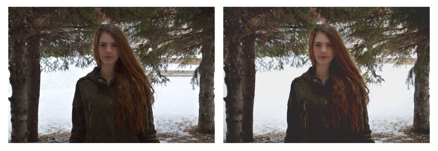
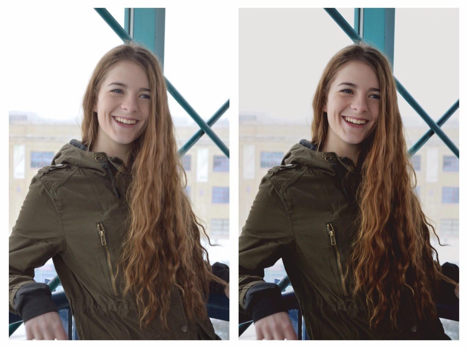
Since I was having no luck with finding film effect tutorials on youtube, I thought I would try to search it up on my pinterest. I often use pinterest for photo inspiration, ideas, or I use the photoshop tutorials I find on it. Pinterest has many photos that I love, and that have the exact look I was looking for, so I thought I'd give it a try. I was very successful when I did this! After looking through different Pinterest posts on film effects, I found one that explained how to do it very clearly! From that post I successfully edited my first film effect edit. (Check out pictures at the end of this blog post) 

This is how I managed to get the film effect. You open up curves on photoshop, and you need to do these two key things to get this certain look.
Step One: The left bottom corner you need to take the curves line and move it up. This increases the brightness in the dark areas of the picture.

Step Two: Move it to the right which reduces the detail in the picture.

Something that was also suggested to do on the blog post that I used, was yo take the top right corner curve line and move it down and move it to the left to "crush the white", as said in the blog.


Another thing that I found to make the picture pop more is to take the middle of the curve line and pull it up. This boosts the contrast of the picture, giving it a brighter look. 

I was really excited when I figured this out! Not only had I finally got the look I was looking for, but it was also super easy! 

I tried doing it on different pictures and loved the results. As I practiced more with curves, I ended up really enjoying using it and feel more confident when I use it that I know what I am doing which I am very excited about. 

One another thing I found out is to get more of a film effect you should make more curve layers. This will put a new curve layer on top of another layer and gives your picture a even cooler look. 

Here are the before and after of my film effect pictures:


This is the link to the blog that helped me learn about the film effect: Film Effect


Wednesday, December 31, 2014

Keeping Your Subject In Colour

Yesterday I learned how to do two new things in photoshop. One thing I actually learned by accident, and the other thing I learned was what I was actually trying to learn in the first place.

The thing I was orginally trying to learn how to do, was taking the subject of your photo and keeping them in colour and leaving the rest of the photo in black in white. I wouldn't do this kind of edit to any picture, I would only do it with sport photos. I think doing it with any ordinary picture would make it look kind of cheesy and a little dumb. 

The thing I learned by accident was using splashes of colour in your photo with photoshop. The point of using splashes of colour is making one certain colour in your picture pop. I don't think I would ever use this kind of edit on a regular basis either, but it was cool learning how to do it! 

When learning about colour splashes and just keeping your one subject in colour I used a picture that I took at the beginning of this of my sister Danielle playing volleyball. I am using her as my main subject in both of the pictures.

How to use colour splashes:
I learned how to do use colour splashes by watching this watching this tutorial: Colour Splashes. You should check it out if your are interested in using colour splashes!

First Step

So the first thing I did when I accidentally learned about colour splashes was I went to Select, which is located at the very top of the computer screen and selected the option Color Range... 

Second Step


After you hit Colour Range, a Colour Range bar comes up. This is where I realized that the tutorial I was watching was not going to teach me what I originally wanted to learn.  The point of colour range is to pick just one colour to use. There are two ways to pick the colour you want to use. The first way is to just select the colour you want by clicking the colour on you picture. For example, if I wanted to use the colour in Danielle's jersey I would just take my mouse and click on her jersey and photoshop will recognize what colour Danielle's jersey is and  will use it. The other way to select the colour you want to use is by using the colour range tool bar. You click on the select option and colour options pop up. (Demonstrated in image #2). Either way of doing it works well. I tried out both ways and they turned out the same.


Last Step
The last step is making the rest of the picture black and white. You go to the right bottom corner of your screen and select the half black, half white circle. A bunch of selections will pop up. You select the Black & White option and then your picture will be in black and white, except for the colours you chose in colour range to pop out.


Colour Splash Effect

This is how my colour splash picture turned out. As you can see, this is a picture that should not be used when using colour splash because the colour I used is everywhere in the picture.This means that Danielle is no longer the main subject of my picture. In the tutorial video, the guy teaching about colour splash using a picture of fruit. This is a picture that is more commonly used for colour splash because the colour that is meant to be shown is only in one part of the picture, which is most commonly the main subject of the picture. If I was going to use colour splash I would probably use a picture of a flower or something that has a vibrant colour, one that would really pop out, unlike the colour of Danielle's volleyball jersey.    


How to keep your subject in colour:
So this is what I actually wanted to learn how to do. I've seen a lot of sport pictures or even advertisement photos where this is being used, so I thought I'd give it a try. I tried to youtube tutorials on how to do this, but I actually couldn't find any. My search results kept popping up with more colour splash tutorials. So I googled it, and actually found a website that shows you how to do it in the format that I usually use on my blog, which I thought was pretty cool. Here is the link to check out the website I used: Keeping Your Subject In Colour.  
First Step


The steps to do this a very simple - but the whole thing is very time consuming, as I will explain in more detail later. 

First thing you do is go to the top of your screen and select Layer and then select New Adjustment Layer and then Channel Mixer.  


Second Step
Third Step


After you select channel mixer, a New Layer bar pops up. You don't have do do anything with this, so you just hit Okay.


Another bar pops up after you hit okay called Channel Mixer. This is the tool where you make your picture black and white. To make it black and white you select the Monochrome button that is on the bottom left corner of the Channel Mixer bar.

Tool Box
This is the time consuming part of this kind of edit. You are now going to use your tool box, which is usually located on the left hand side of your screen. So before you start, you have to make sure your Foreground and Background setting are set to black and white. I don't actually know what would happen if they were not set to black and white, but my guess would be that you missed a step and your picture isn't in black and white. After you made sure your foreground and background are black and white, you use your brush tool. All you do with the brush tool is colour the part of the picture you want in colour! Which sounds easy enough, but it ends up taking awhile because you have to go slow and make sure to not to colour anything that is not your main subject. Some helpful tools that I figured out how to use while doing this is the eraser tool and the zoom tool. The eraser tool is obviously helpful for erasing things.. whenever you colour something other than your subject just take the eraser tool and erase over it. The zoom tool really helps for when you are colouring the little parts of the picture. For example I used the zoom tool alot when I coloured Danielle's fingers because they are so little and would have been very hard to colour without the zoom tool. 
If you don't know where the tools that I just talked about are on your toolbox, I made a picture that shows you exactly where they are. The foreground and background tool I circled in purple, the zoom tool I circled in yellow, the eraser tool is circled in green and the paintbrush tool is circled in purple.  

Some other helpful tips on using these tools are:
Eraser and Paintbrush Tool


When using the eraser tool and paintbrush tool you can change the sizes of the eraser and paintbrush. This is something you have to know how to use because the things you are painting/erasing are all different shapes and sizes. It is located in the top left hand corner of your screen. A trick I learned while using this tool is that when you want to change sizes of your brush you don't have to keep going to the left top corner of your screen to change the brush size, instead just right click your mouse and the options of different brush sizes come right to you!   


Zoom Tool
When using the zoom tool you just keep clicking on the spot on the picture that you want a closer look at. To zoom out of the picture, you have to go to the top left hand corner of the screen and click on the icon of a magnify glass with a subtract symbol inside of it.
So that is what I learned in photoshop recently! Its probably not a edit that I am going to use often, but I think its cool and am glad that I now have a better understanding on how to use these tools in photoshop. 

Before 
After 


Monday, December 29, 2014

Curves

While learning more about photoshop, I found a lot of tutorials talk about using a tool called curves. So I decided to take the time to learn more about it. Curves allows you to change the contrast, brightness and exposure all at once, instead of using each of the tools I used in my last photo. Curves is supposedly better to use, because you have more control over the settings. I have not mastered curves completely, but here is all that I learned about curves and another finished product that I am going to share.


Curves tool bar 

Now at first if you look at the curves tool and do not know anything about it, it looks extremely confusing. It is still a bit confusing to me,  but after watching tutorials and reading about it, it makes a bit more sense.

So the main point of curves, is that it gives you the ability to control the light and dark colours in your image.


Channel option, where you choose what colours
you want to change 
In the top left hand corner of the curves tool there is the option called channel. If you look at the above diagram,  you can see the channel bar. It currently says its at RGB. This means that you are controlling the red, green and blue colours in your image all at once. If you click on the arrows on the channel bar, you can also choose other options that are called RedGreen and Blue. These options just mean that you are controlling specifically the red, green or blue in your image.


The line running through the centre of this box is what
you are using.
To actually control the light and darkness in your image you use the line that is running diagonally across the box that is located in the centre of the curves tool. These are the helpful tips that I have learned on how to use curves:
- When you take your mouse and grab any part of the line and you move the line from left to right, you move the the light in the picture
- The top right corner of the box is the lightest part in the image. If you took the line and pulled it down it would make your image darker. If you pulled it to the left it would make the image brighter.
- The bottom left corner of the box is the darkest part  in the image. If you took the line and pulled it upwards it would make the image lighter. If you took the  line and moved it to the right it would make the image darker.


The thing I found frustrating with curves is that there isn't a certain type of instructions to follow when using it. Every picture is different so the levels of colours varies in every image. So you kind of have to wing it and trust your judgement on what looks good on you picture when changing things with the curves tool. Right now, I am finding that I would prefer to use the tools I used in my last blog post compared to this curves tool. But I'm sure with the more I use the curves tool, the more comfortable I will feel with it.

I played around with the curves tool and got many different results:
Curves Trial #1

Curves Trial #1: This picture I hate a lot... I don't really know why I thought it looked good. I think one night I was editing it, and must of been super tired or something and for some reason thought the edit looked good. Then the next morning I saw how awful it looked and knew that I was not done with this picture.


Curves Trial #2


Curves Trial #2: This one was a lot better from the first. I liked it, but I wanted a bit more of a dramatic change. Also I played to much with the red in the picture. If you look at my friend Taylor's face in the picture you can see that it is really red and pinkish and I did not like that. 
Curves Trial #3


Curves Trial #3: This one I liked a lot, but I wanted the photo to still look more darker, and the contrast to be better. I used the gradient effect on it to give the picture a faded look which I liked. I decided to work with this picture a bit more, just to see if I could do anything better with the curves tool.


Curves Trial #4


Curves Trial #4: This one I am pretty happy with. I played more with the blue curves option, changing the red and green curves options along the way so that the picture didn't look super blue. The picture has a more dramatic feel to it which I am quite happy about. I think this picture is going to be another successful finished product.


Before and After Shots: 


Here is also another thing I learned while creating this blog post - How to change a PSD file to a JPEG. You should learn how to do this because the photoshop file is WAY to big. Blogger cannot even upload a photoshop file because it is so large.
Step 1: Go to file and select the Save As option 
Step 2: A save as bar is going to open up. On the format option hit the arrows and select the JPEG option. Then hit save.
Step 3: A JPEG Options bar will pop up. This allows you to change sizes of you JPEG. I didn't change anything when this popped up because I want the picture to stay the same quality that it originally was in photoshop. And that is all you have to do when taking a photoshop file and changing it into a JPEG! 

Here are the links to tutorials that really helped me:


Saturday, November 29, 2014

First Finished Product

I have successfully finished editing my first picture in photoshop! I took the picture I talked about in my last blog post and I figured out how to make black and white images. There are a couple of ways to change a picture into a black and white image, but I liked this one way the best, and I will tell you what it is!

Here are the steps I used to change my picture, with picture examples so that you can get a better idea of what tools/settings that I used to make my picture black and white and what tools I used to enhance the picture. The picture examples with the description will give you a clearer demonstration on what I all used to change my picture and how to access them in case you are wondering how to do it yourself in photoshop. 


Changing your photo into a black and white image: 


Step 1: Go to the top of your screen and select images
Step 2: Select the adjustments option
Step 3: Then click gradient map
Step 4: A bar will pop up, hit the okay option and then viola! Your picture is in black and white.
Step 5: When you are done, hit the okay button. 

Changing your exposure: 
Step 1: Go to the top of your screen and select images. 
Step 2: Select the adjustment options. 
Step 3:  Pick the exposure setting.
Step 4: Play around with the exposure, offset and gamma correction bar by moving the scale up or down until you feel that your picture is properly exposed.
Step 5: When you are done, hit the okay button. 

Changing brightness and contrast:
Step 1: Go to the top of your screen and select images. 
Step 2: Select the adjustment options. 
Step 3: Pick the Brightness/Contrast option
Step 4:  Play with the contrast and the brightness bar until you feel like you found the right option for your picture.
Step 5: When you are done, hit the okay button. 

Changing colour balance:
Step 1: Go to the top of your screen and select images. 
Step 2: Select the adjustment options. 
Step 3: Pick the Colour Balance option
Step 4: Move the Cyan, Magenta and Yellow scales up and down, until you find the right settings for you picture. 
Step 5: When you are done, hit the okay button. 

After I used all these tools on photoshop I was pretty satisfied with my picture. But I thought I'd ask someone else for suggestions on what else I could do to my picture, because Im always wanting to find new ways to improve my pictures. I talked to my friend Felicity, who is also doing photography for her passion project. Felicity is amazing photographer who has a lot of experience with photoshop. I sent my picture to her, asking for some advice on what else I could change to my picture to improve it. She suggested to add a little vignette to the sides of the picture and to add midpoint. She said these features would make the picture pop more. I googled it, and figured out how to use these tools. Here is what I did:  


Adding vignette and midpoint:
Step 1: Go to the top of your screen and select Filter.
Step 2: Select the Distort option.
Step 3: Pick the Lens correction option.
Step 4: A large screen will pop up showing a big version of your picture. To add vignette and midpoint to your picture, move the vignette and mid point bars up or down, until you are satisfied with how it looks. *Note: when the screen pops up with your picture a grid will be over it. If you want to move the grid because it is a little distracting, click the check mark box by the Show Grid option on the bottom right hand side of the screen*
Step 5: When you are done, hit the okay button.

Here is my first finished photoshop edit. I am very happy with how it turned out, and am already feeling more comfortable with using photoshop:
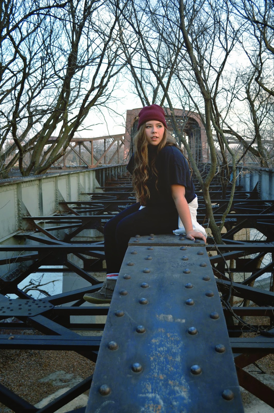
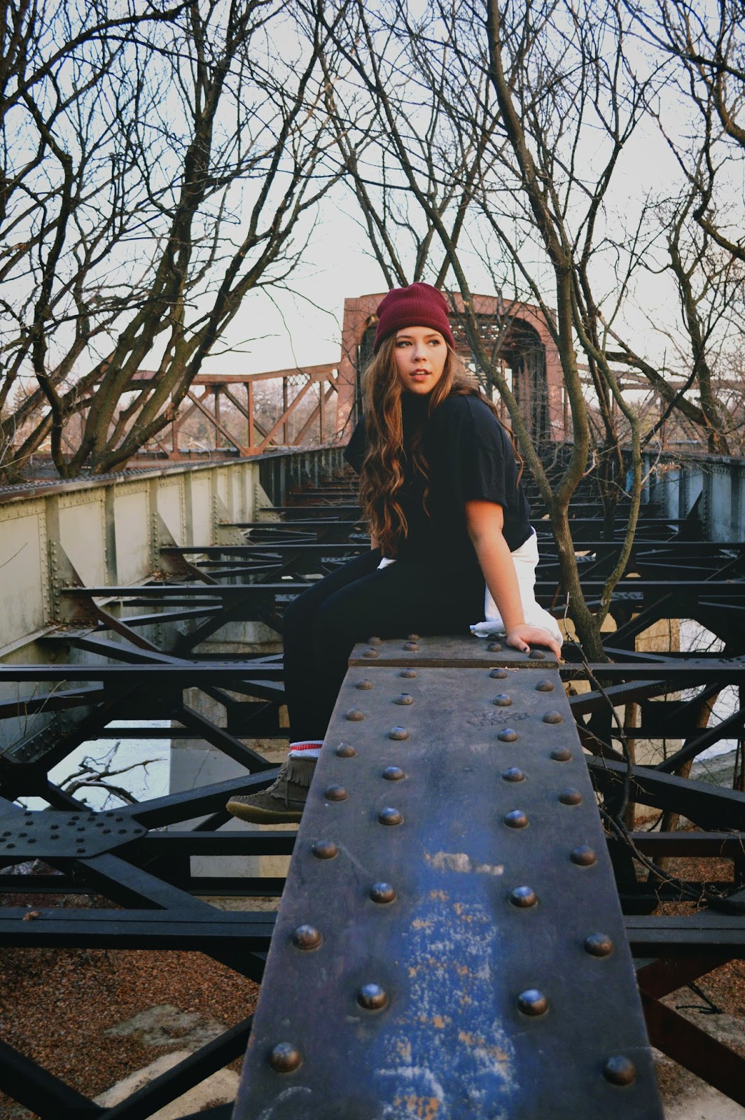
The before
and after picture!
Thanks again to my friend Felicity Pollard for the help with editing my picture! Check out Felicitys blog:http://devolpingnegatives.wordpress.com. She has some really beautiful pictures :) 
If you want to see more of my pictures check out my filckr account: My flickr account

Here are the youtube tutorials that helped me learn all the things I talked about: