Pages

Wednesday, December 31, 2014

Keeping Your Subject In Colour

Yesterday I learned how to do two new things in photoshop. One thing I actually learned by accident, and the other thing I learned was what I was actually trying to learn in the first place.

The thing I was orginally trying to learn how to do, was taking the subject of your photo and keeping them in colour and leaving the rest of the photo in black in white. I wouldn't do this kind of edit to any picture, I would only do it with sport photos. I think doing it with any ordinary picture would make it look kind of cheesy and a little dumb. 

The thing I learned by accident was using splashes of colour in your photo with photoshop. The point of using splashes of colour is making one certain colour in your picture pop. I don't think I would ever use this kind of edit on a regular basis either, but it was cool learning how to do it! 

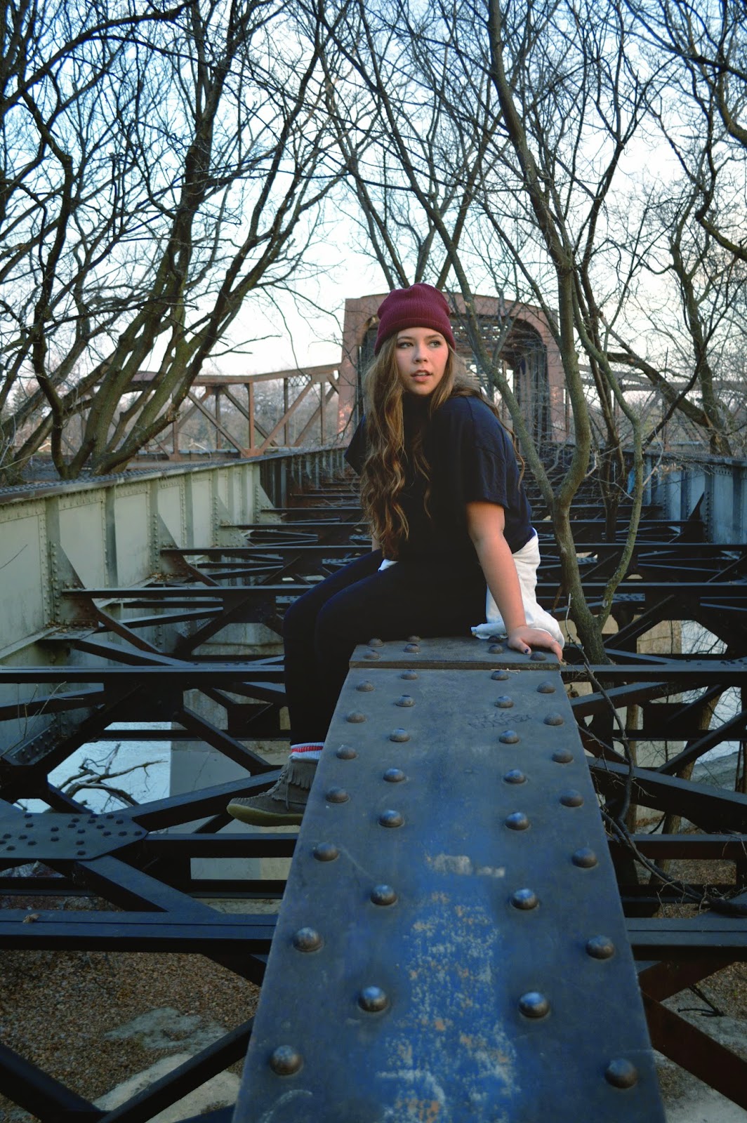
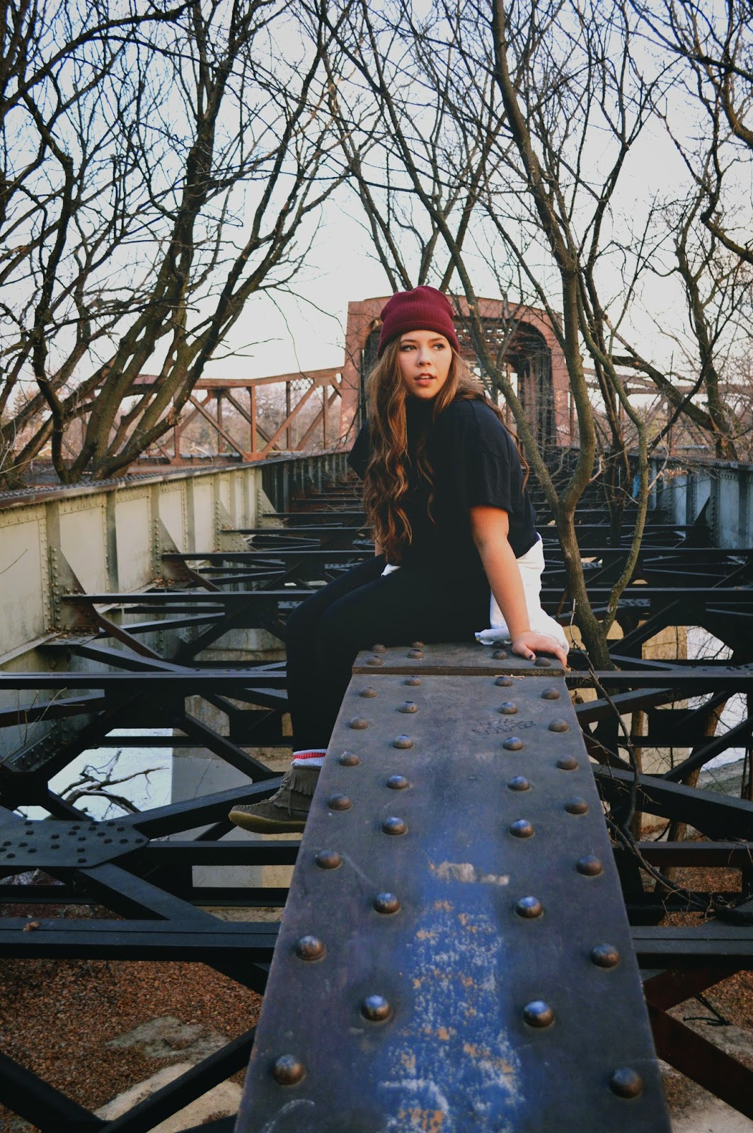
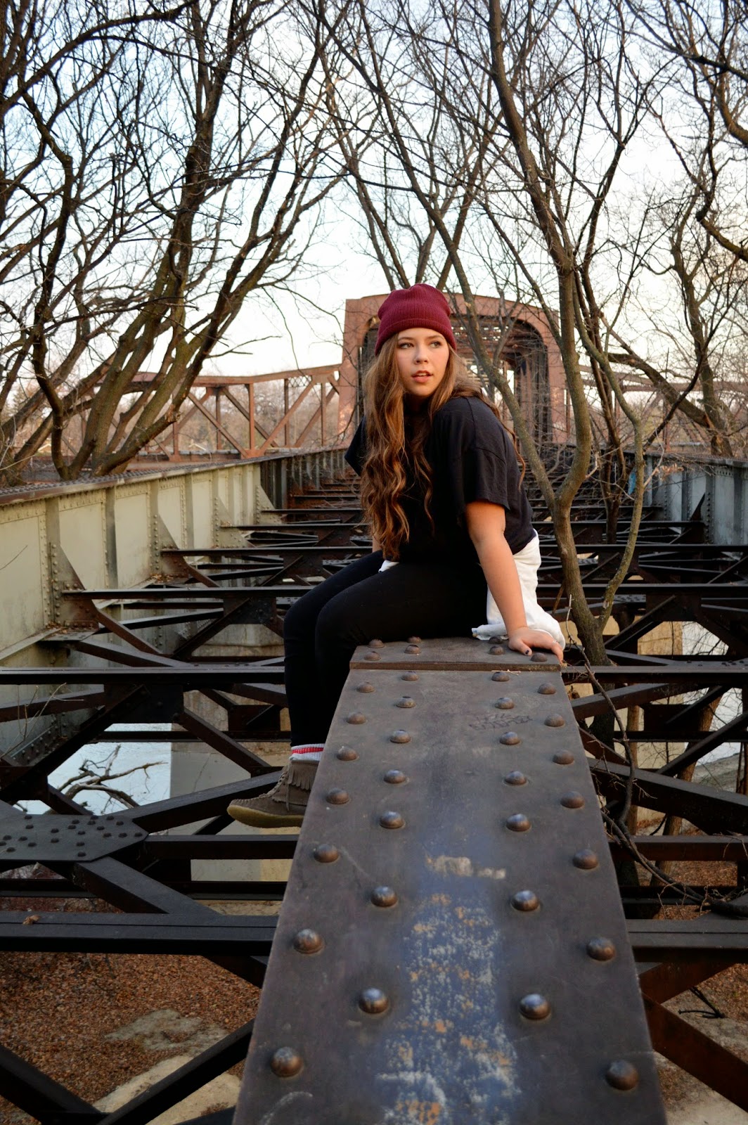
When learning about colour splashes and just keeping your one subject in colour I used a picture that I took at the beginning of this of my sister Danielle playing volleyball. I am using her as my main subject in both of the pictures.

How to use colour splashes:
I learned how to do use colour splashes by watching this watching this tutorial: Colour Splashes. You should check it out if your are interested in using colour splashes!

First Step

So the first thing I did when I accidentally learned about colour splashes was I went to Select, which is located at the very top of the computer screen and selected the option Color Range... 

Second Step


After you hit Colour Range, a Colour Range bar comes up. This is where I realized that the tutorial I was watching was not going to teach me what I originally wanted to learn.  The point of colour range is to pick just one colour to use. There are two ways to pick the colour you want to use. The first way is to just select the colour you want by clicking the colour on you picture. For example, if I wanted to use the colour in Danielle's jersey I would just take my mouse and click on her jersey and photoshop will recognize what colour Danielle's jersey is and  will use it. The other way to select the colour you want to use is by using the colour range tool bar. You click on the select option and colour options pop up. (Demonstrated in image #2). Either way of doing it works well. I tried out both ways and they turned out the same.


Last Step
The last step is making the rest of the picture black and white. You go to the right bottom corner of your screen and select the half black, half white circle. A bunch of selections will pop up. You select the Black & White option and then your picture will be in black and white, except for the colours you chose in colour range to pop out.


Colour Splash Effect

This is how my colour splash picture turned out. As you can see, this is a picture that should not be used when using colour splash because the colour I used is everywhere in the picture.This means that Danielle is no longer the main subject of my picture. In the tutorial video, the guy teaching about colour splash using a picture of fruit. This is a picture that is more commonly used for colour splash because the colour that is meant to be shown is only in one part of the picture, which is most commonly the main subject of the picture. If I was going to use colour splash I would probably use a picture of a flower or something that has a vibrant colour, one that would really pop out, unlike the colour of Danielle's volleyball jersey.    


How to keep your subject in colour:
So this is what I actually wanted to learn how to do. I've seen a lot of sport pictures or even advertisement photos where this is being used, so I thought I'd give it a try. I tried to youtube tutorials on how to do this, but I actually couldn't find any. My search results kept popping up with more colour splash tutorials. So I googled it, and actually found a website that shows you how to do it in the format that I usually use on my blog, which I thought was pretty cool. Here is the link to check out the website I used: Keeping Your Subject In Colour.  
First Step


The steps to do this a very simple - but the whole thing is very time consuming, as I will explain in more detail later. 

First thing you do is go to the top of your screen and select Layer and then select New Adjustment Layer and then Channel Mixer.  


Second Step
Third Step


After you select channel mixer, a New Layer bar pops up. You don't have do do anything with this, so you just hit Okay.


Another bar pops up after you hit okay called Channel Mixer. This is the tool where you make your picture black and white. To make it black and white you select the Monochrome button that is on the bottom left corner of the Channel Mixer bar.

Tool Box
This is the time consuming part of this kind of edit. You are now going to use your tool box, which is usually located on the left hand side of your screen. So before you start, you have to make sure your Foreground and Background setting are set to black and white. I don't actually know what would happen if they were not set to black and white, but my guess would be that you missed a step and your picture isn't in black and white. After you made sure your foreground and background are black and white, you use your brush tool. All you do with the brush tool is colour the part of the picture you want in colour! Which sounds easy enough, but it ends up taking awhile because you have to go slow and make sure to not to colour anything that is not your main subject. Some helpful tools that I figured out how to use while doing this is the eraser tool and the zoom tool. The eraser tool is obviously helpful for erasing things.. whenever you colour something other than your subject just take the eraser tool and erase over it. The zoom tool really helps for when you are colouring the little parts of the picture. For example I used the zoom tool alot when I coloured Danielle's fingers because they are so little and would have been very hard to colour without the zoom tool. 
If you don't know where the tools that I just talked about are on your toolbox, I made a picture that shows you exactly where they are. The foreground and background tool I circled in purple, the zoom tool I circled in yellow, the eraser tool is circled in green and the paintbrush tool is circled in purple.  

Some other helpful tips on using these tools are:
Eraser and Paintbrush Tool


When using the eraser tool and paintbrush tool you can change the sizes of the eraser and paintbrush. This is something you have to know how to use because the things you are painting/erasing are all different shapes and sizes. It is located in the top left hand corner of your screen. A trick I learned while using this tool is that when you want to change sizes of your brush you don't have to keep going to the left top corner of your screen to change the brush size, instead just right click your mouse and the options of different brush sizes come right to you!   


Zoom Tool
When using the zoom tool you just keep clicking on the spot on the picture that you want a closer look at. To zoom out of the picture, you have to go to the top left hand corner of the screen and click on the icon of a magnify glass with a subtract symbol inside of it.
So that is what I learned in photoshop recently! Its probably not a edit that I am going to use often, but I think its cool and am glad that I now have a better understanding on how to use these tools in photoshop. 

Before 
After 


Monday, December 29, 2014

Curves

While learning more about photoshop, I found a lot of tutorials talk about using a tool called curves. So I decided to take the time to learn more about it. Curves allows you to change the contrast, brightness and exposure all at once, instead of using each of the tools I used in my last photo. Curves is supposedly better to use, because you have more control over the settings. I have not mastered curves completely, but here is all that I learned about curves and another finished product that I am going to share.


Curves tool bar 

Now at first if you look at the curves tool and do not know anything about it, it looks extremely confusing. It is still a bit confusing to me,  but after watching tutorials and reading about it, it makes a bit more sense.

So the main point of curves, is that it gives you the ability to control the light and dark colours in your image.


Channel option, where you choose what colours
you want to change 
In the top left hand corner of the curves tool there is the option called channel. If you look at the above diagram,  you can see the channel bar. It currently says its at RGB. This means that you are controlling the red, green and blue colours in your image all at once. If you click on the arrows on the channel bar, you can also choose other options that are called RedGreen and Blue. These options just mean that you are controlling specifically the red, green or blue in your image.


The line running through the centre of this box is what
you are using.
To actually control the light and darkness in your image you use the line that is running diagonally across the box that is located in the centre of the curves tool. These are the helpful tips that I have learned on how to use curves:
- When you take your mouse and grab any part of the line and you move the line from left to right, you move the the light in the picture
- The top right corner of the box is the lightest part in the image. If you took the line and pulled it down it would make your image darker. If you pulled it to the left it would make the image brighter.
- The bottom left corner of the box is the darkest part  in the image. If you took the line and pulled it upwards it would make the image lighter. If you took the  line and moved it to the right it would make the image darker.


The thing I found frustrating with curves is that there isn't a certain type of instructions to follow when using it. Every picture is different so the levels of colours varies in every image. So you kind of have to wing it and trust your judgement on what looks good on you picture when changing things with the curves tool. Right now, I am finding that I would prefer to use the tools I used in my last blog post compared to this curves tool. But I'm sure with the more I use the curves tool, the more comfortable I will feel with it.

I played around with the curves tool and got many different results:
Curves Trial #1

Curves Trial #1: This picture I hate a lot... I don't really know why I thought it looked good. I think one night I was editing it, and must of been super tired or something and for some reason thought the edit looked good. Then the next morning I saw how awful it looked and knew that I was not done with this picture.


Curves Trial #2


Curves Trial #2: This one was a lot better from the first. I liked it, but I wanted a bit more of a dramatic change. Also I played to much with the red in the picture. If you look at my friend Taylor's face in the picture you can see that it is really red and pinkish and I did not like that. 
Curves Trial #3


Curves Trial #3: This one I liked a lot, but I wanted the photo to still look more darker, and the contrast to be better. I used the gradient effect on it to give the picture a faded look which I liked. I decided to work with this picture a bit more, just to see if I could do anything better with the curves tool.


Curves Trial #4


Curves Trial #4: This one I am pretty happy with. I played more with the blue curves option, changing the red and green curves options along the way so that the picture didn't look super blue. The picture has a more dramatic feel to it which I am quite happy about. I think this picture is going to be another successful finished product.


Before and After Shots: 


Here is also another thing I learned while creating this blog post - How to change a PSD file to a JPEG. You should learn how to do this because the photoshop file is WAY to big. Blogger cannot even upload a photoshop file because it is so large.
Step 1: Go to file and select the Save As option 
Step 2: A save as bar is going to open up. On the format option hit the arrows and select the JPEG option. Then hit save.
Step 3: A JPEG Options bar will pop up. This allows you to change sizes of you JPEG. I didn't change anything when this popped up because I want the picture to stay the same quality that it originally was in photoshop. And that is all you have to do when taking a photoshop file and changing it into a JPEG! 

Here are the links to tutorials that really helped me:


Saturday, November 29, 2014

First Finished Product

I have successfully finished editing my first picture in photoshop! I took the picture I talked about in my last blog post and I figured out how to make black and white images. There are a couple of ways to change a picture into a black and white image, but I liked this one way the best, and I will tell you what it is!

Here are the steps I used to change my picture, with picture examples so that you can get a better idea of what tools/settings that I used to make my picture black and white and what tools I used to enhance the picture. The picture examples with the description will give you a clearer demonstration on what I all used to change my picture and how to access them in case you are wondering how to do it yourself in photoshop. 


Changing your photo into a black and white image: 


Step 1: Go to the top of your screen and select images
Step 2: Select the adjustments option
Step 3: Then click gradient map
Step 4: A bar will pop up, hit the okay option and then viola! Your picture is in black and white.
Step 5: When you are done, hit the okay button. 

Changing your exposure: 
Step 1: Go to the top of your screen and select images. 
Step 2: Select the adjustment options. 
Step 3:  Pick the exposure setting.
Step 4: Play around with the exposure, offset and gamma correction bar by moving the scale up or down until you feel that your picture is properly exposed.
Step 5: When you are done, hit the okay button. 

Changing brightness and contrast:
Step 1: Go to the top of your screen and select images. 
Step 2: Select the adjustment options. 
Step 3: Pick the Brightness/Contrast option
Step 4:  Play with the contrast and the brightness bar until you feel like you found the right option for your picture.
Step 5: When you are done, hit the okay button. 

Changing colour balance:
Step 1: Go to the top of your screen and select images. 
Step 2: Select the adjustment options. 
Step 3: Pick the Colour Balance option
Step 4: Move the Cyan, Magenta and Yellow scales up and down, until you find the right settings for you picture. 
Step 5: When you are done, hit the okay button. 

After I used all these tools on photoshop I was pretty satisfied with my picture. But I thought I'd ask someone else for suggestions on what else I could do to my picture, because Im always wanting to find new ways to improve my pictures. I talked to my friend Felicity, who is also doing photography for her passion project. Felicity is amazing photographer who has a lot of experience with photoshop. I sent my picture to her, asking for some advice on what else I could change to my picture to improve it. She suggested to add a little vignette to the sides of the picture and to add midpoint. She said these features would make the picture pop more. I googled it, and figured out how to use these tools. Here is what I did:  


Adding vignette and midpoint:
Step 1: Go to the top of your screen and select Filter.
Step 2: Select the Distort option.
Step 3: Pick the Lens correction option.
Step 4: A large screen will pop up showing a big version of your picture. To add vignette and midpoint to your picture, move the vignette and mid point bars up or down, until you are satisfied with how it looks. *Note: when the screen pops up with your picture a grid will be over it. If you want to move the grid because it is a little distracting, click the check mark box by the Show Grid option on the bottom right hand side of the screen*
Step 5: When you are done, hit the okay button.

Here is my first finished photoshop edit. I am very happy with how it turned out, and am already feeling more comfortable with using photoshop:
The before
and after picture!
Thanks again to my friend Felicity Pollard for the help with editing my picture! Check out Felicitys blog:http://devolpingnegatives.wordpress.com. She has some really beautiful pictures :) 
If you want to see more of my pictures check out my filckr account: My flickr account

Here are the youtube tutorials that helped me learn all the things I talked about:


Friday, November 21, 2014

Complications and Successes

The beginning of the photo shoot, Miranda and
Taylor carrying their bags of clothing. 
I went on a photoshoot with my friends Taylor Vaags and Miranda Vlaming. Taylor and I will be working on this project together a lot so we decided that doing a photoshoot together would be fun and also helpful. Miranda came as a extra model. All three of us brought bags of clothing for costume changes and everything, which provided entertainment throughout the shoot! It was nice having Taylor there so that her and I could talk about what modes we were using to take different pictures and it was nice to be able to collaberate with someone during the shoot. We went to Kildonana Park around 3:30pm and didnt end up leaving until 5:30pm. Because of daylight savings, it was getting dark pretty fast so we also needed to move very fast, which we thought might be a bit stressful, but the pictures turned out nicely and we all had a lot of fun.

For using photoshop I am having a bit of troubles. The program I am using is a older version of photoshp (Photoshop CS3) and all the tuturiols I am looking at requires the newer version. Also, Ive heard from some friends of mine that using the newer version of photoshop is also quite a lot easier to use, then the old version that I am using... which is a bit frustrating. At first, Taylor and I talked about splitting the cost and purchasing photoshop together, but it turns out that this program can cost around $600! Which is not what we expected at all. I have an interest in getting the newer photoshop program, but am unsure of how to I will be doing this. I guess for now, I will just have to look at tutorials with the photoshop that I have. 

I  am currently working on one picture from the photoshoot. It is a picture of taylor and miranda together. I love this picture because you can see how happy the two of them are together, and that they love being together which I like to focus on.  The problem with the picture is that our bags of clothing are in the background and it is VERY distracting. It probably doesnt help that the bag is hot pink either...haha. So I figred out how to take the bag out which is something I was very happy about! Here is the before and after shots of the pictures: 
Before, with a very distracting bag in the background 
After, a hot pink bag free picture!

How I did it: 
On the left side of the computer screen there is a bar that is called the toolbox. To remove an object from a picture you go to your tool box and select the stamp tool. Then you hit the alt key on your keyboard and you drag over a part of the picture that you can replace your unwanted object with. For example, I replaced the bag with the path that would have been shown in the picture if the bag was not there. So I dragged my stamp tool over another part of the path in the picture that is shown. Ater you do that you let go of the alt key and click your mouse and drag the stamp over the object you don't want. It looks like you are coloring a picture when you do this step! One problem I had with this is that when I was "colouring" over the object I wanted to remove, was that other part of the picture would start showing up, instead of the path that I had been copying! I found out that you just need to keep repeating the first steps because the stamp tool starts copying other objects in the picture as you move away from the original object that you are copying. Then after your object is removed from the picture, you go to the tool bar and select the healing brush tool and click and hold down the curser over the area that you copied. This tool allows things to blend into their surroundings, looking more natural.
Instagram post 

Being the typical girl teenager, I posted my pictures on instagram. I took two other pictures of Miranda and Taylor that didn't have the bag in the background I edited the pictures in VSCOcam and made the pictures black and white. I loved the way these pictures looked in black and white! So my new goal is to learn how to make black and white pictures on photoshop, so that i can make the picture that i took the bag out of even nicer :) So this picture is not a finished product...yet!

If you want to look at more pictures I took with miranda and taylor, check out my flicker account!
My flickr account

Here is a youtube tutor that helped me out a lot:
Removing unwanted objects


Friday, October 31, 2014

Editing Programs

I recently got the computer program Photoshop and just downloaded it onto my computer. I haven't gotten around do using it yet. I haven't decided if I should take some old photos that I took this summer, or go out and do a photoshoot to get brand new photos for this whole project. I think I may try doing a bit of both. 
I thought I would blog about one editing program that I love, and is super easy to use. It is an app called VSCOcam. It gives you a variety of different options. It isn't one of those apps that gives you bunch of ugly filters, and it actually enhances your pictures and makes them look professional. You can also adjust your contrast, exposure, temperature, clarity and make certain colors pop. 

Another basic editing program I use is iPhoto. If you have a mac, it probably comes with this program. iPhoto just deals with all of the basic stuff, and is the program I worked with last year. iPhoto helps you with straightening and cropping, contrast, exposure, saturation, definition, sharpness, and also gives you a few flitters. (That aren't very nice). It helps with the easy stuff, but doesn't really make your photos look professional, like the VSCOcam does.

I want to learn why and how the VSCOcam makes your pictures look so much better. I might add this to my project and try researching what the different filters VSCOcam does to your photos. I would really suggest to those people with smart phones to get the VSCOcam app, it is free and works great!

Saturday, January 18, 2014

Passion Project is a Success!

Well I am officially finished my Passion Project! I just thought I would blog about a few couple of things.

Class Presentation
Yesterday I presented my project to my class. I thought that everything went really well. I talked about how I got my Nikon D3200, how I really enjoy this camera and I feel confident on how to use my camera after this project.  I talked about how I completed my goal by learning 15 different types of photography and how I took 5 different pictures for each type of photography that I learned about, and how I posted all 75 of my pictures on my Flickr account. I also talked about some of the biblical through lines that we have been learning in my bible class. I haven’t talked about the through lines on my blog yet so I thought I would talk about them later on in this blog post. After talking about the through lines, I showed 15 of my pictures. I got a lot of compliments from my friends, which I was very happy about! J  I then summarized what I learned through this project. I learned more about the rule of thirds, what to focus on in certain pictures and what to blur, how to edit my pictures, to always take a lot of pictures and to always have fun when taking pictures! Obviously I learned WAY more then that, but only had 5 minutes to present so I couldn’t explain everything. On each of my blogs I wrote in point form about all the things that I learned about the type of photography that I focused on so if you’re interested in all that I learned about photography you should check them all out! At the end of this presentation I talked about how this successful this project was. I talked about how happy I am with my camera, how I learned how to take some nice pictures and that I honestly had a lot of fun! It ended up being a lot of work, but it was all worth it. I’m excited to use all the stuff that I learned through out this year with my camera.
 
Biblical Through Lines
The biblical through lines is something that my grade 11 bible teacher has been talking to my class about. There are 10 different biblical through lines. They are God worshipping, idolatry – discerning, Earth - Keeping, beauty creating, justice - seeking, creation – enjoying, servant – working, community – building, image – reflecting, order – discovery. I picked 2 of the through lines to describe my project. I chose Beauty Creating and Creation – enjoying. I think that both of these through lines have something in common. They both talk about reflecting on the beauty of the earth and appreciating everything God has made and created for us humans to enjoy.  Many of my picture projects involved taking pictures outside. Even though it was freezing most of the time I went outside, I really enjoyed this part of the project. Sometimes I would just fall into the snow and look at everything around me and think how pretty everything looked around me. And I got to capture all of those pretty things that God has given us with my camera and that was a huge part of my project. Without everything God has given us my pictures would look pretty awful! This project allowed me to appreciate and really see all the beauty that God has made and for this I am grateful.

Mentor
I was supposed to have a mentor for this project. I talked to my computer teacher Mr. Toews and asked if could help me out if I ever needed any. He agreed willingly. I never ended up needing him for anything though. My main help was the Internet. I learned all of my facts about the types of photography that I learned about through different photographer’s blogs and websites. I would kind of consider my sisters as my mentors as well though. They helped me decided on what pictures I should take and how I should take them. They also helped a lot in setting things up, being my models and holding things into place while I took pictures. A big shout out to them couldn’t of done this project without you guys! 

Resources
At the end of each blog post I put a link to the websites I used to research that type of photography. I suggest you check them out; they are really cool and helped me a lot!

Flickr Account
I was hoping to get a lot of feedback from people on Flickr. I was hoping that people would give me suggestion on how to make my pictures look better, but all I got was a bunch of compliments. Which of=f course was nice to get! But it wasn’t exactly what I was aiming for. If you have a Flickr account please check out my account! My account name is raychel.algera@gmail.com. Please leave comments and tell me what you think of all my pictures! If you don’t have a Flickr account but want to look at all my pictures here is the link to my account. You should be able too view them all without having to make an account.
http://www.flickr.com/photos/108981174@N05/sets/


Wednesday, January 15, 2014

Frozen in Time Photography

Things I learned about Frozen in time photography
- Type of photography where you try to capture a moment on camera
- This type of photography is mainly taken at events.
- Don’t get subjects to pose for you; you actually hope that the subject doesn’t notice you taking pictures of them.
- Shouldn’t use flash so that your subjects wont notice you
- Should try to get picture of people moving, laughing and looking genuinely happy. If your subjects don’t look happy you’re picture won’t turn out to be as nice.
- For beginners you should try taking pictures at family gatherings
- Take a lot of pictures!

I had one major problem with this project. My plan was to take pictures at my last Christmas family gathering. But my family gathering ending up being canceled so I no longer had any events to take pictures at, which is a big thing for frozen time photography. And since this passion project is very close to being finished I couldn’t sit around and wait for the next big event to happen in my life. So I had t make my own event… I took pictures of my sisters playing Just Dance on the wii! I figured since the wii game keeps my sister moving and they enjoy doing it I could get some good frozen in time pictures from it.

For taking pictures I ended up using my action shot mode just because my sisters were moving so fast! They were almost moving too fast because I got so many blurry photos! Like most of the pictures I go of my sisters dancing most of there body was in focus, but an arm or foot would be blurry because that was the body part that was moving so fast. Unfortunately there wasn’t much I could do about this. So I just kept taking pictures! I’m happy how these pictures turned out, but I really wish I could have taken some pictures at an actual event. I guess ill just have to take them at my next family gathering just for fun of it!


Websites I used:
http://www.imagemaven.com/event-photography/